Well, the exhibition is here and I must say, I am impressed. Hope you will be too. Here are a few examples of how the kids used Mathematics to pursue their inquiries into "Conflict".
Tables of Data
Lots of groups conducted surveys across the school community and presented their results as data tables. Some of these tables were very elaborate and contained very detailed information. Much use was made of multiple columns on a table to present results for different groups.
A survey of Year 8 students about body shape. Note use of tally marks and numbers to summarise results. One problem with having all the results presented in one table is that questions that have different responses (eg yes/no; sliding scale etc) need to have different boxes for their data.

Another table, this time using colour to distinguish between the age/year group of the respondents.
Venn Diagrams
Venn diagrams are a really useful way to present information - they are simple, they are visual and they give an insight into how the creator understands the ideas they are representing.

This Venn diagram explores the emotions felt during conflict in the family and conflict in a war. This particular diagram is highly subjective and there is no explanation of where the ideas came from or how they were allocated to a particular circle.
Picture Graphs
Some picture graphs can be quite clever in their simplicity. Their effectiveness stems from their visual nature and the use of interesting images to represent values.
This interesting series of graphs used the picture of the animal as the outline for the graph and then the data was represented by colouring in appropriate proportions of the animal.
Pie Charts
Many groups used pie charts to show their results. This required some interesting calculations as students worked out angle sizes as a ratio of their scores out of the total population. Many simply plugged numbers into Excel and printed out a nice colour chart.
Here are some hand-drawn graphs showing information about palm oil. This group was smart enough to keep the responses to yes/maybe/no - certainly made the graph accessible and relatively simple to construct.
Many groups represented their data on bar or column graphs. This was particularly effective when showing questions where the respondent had multiple alternative responses or the data was showing a comparison of quantities or values.

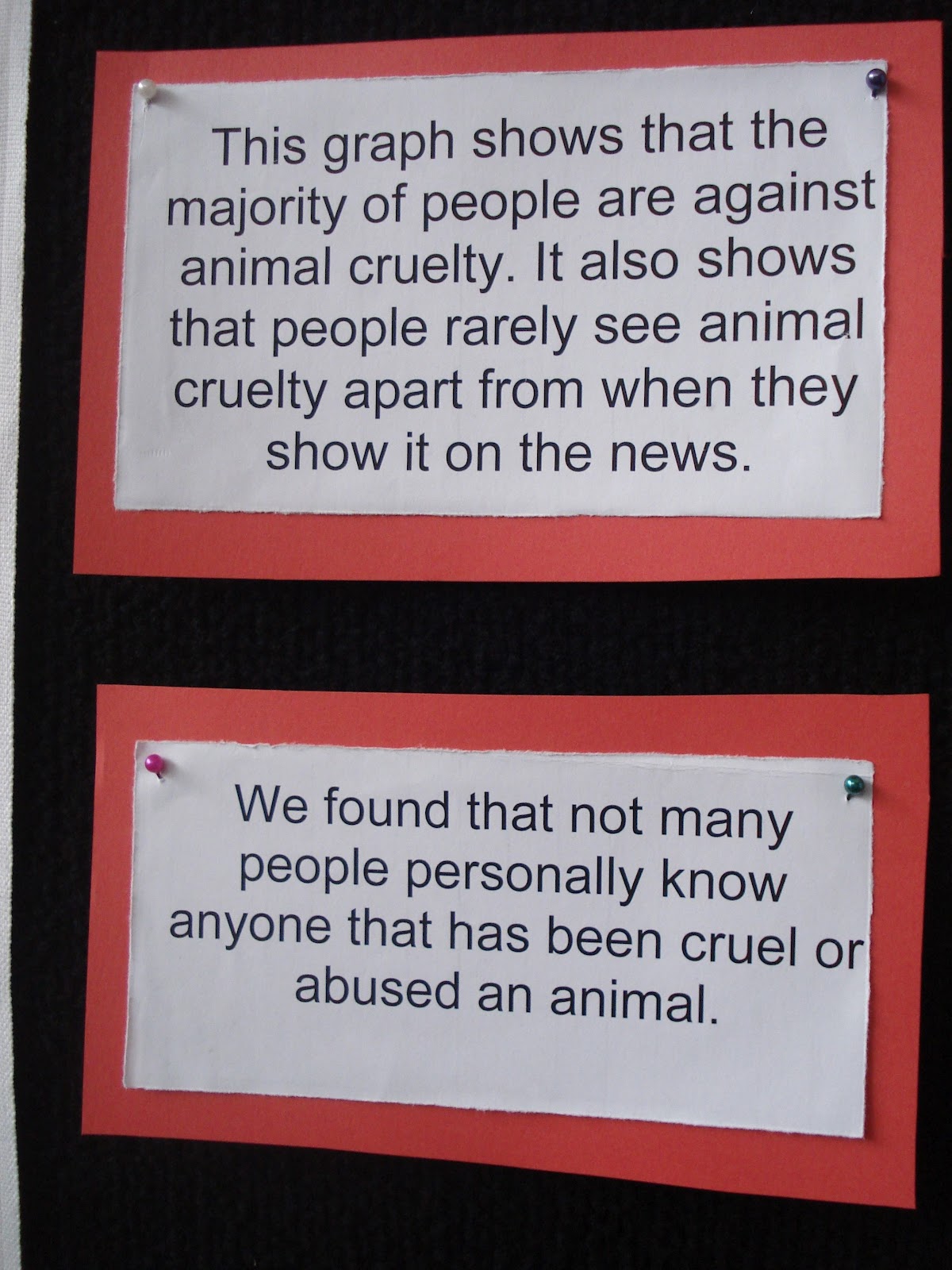
This was an interesting graph for several reasons. The group had survey over 200 people and organised their data into a series of effective graphs. They also provided an interesting explanation of their results. The data was honest - but what does it mean to say that 6 people were in favour of animal cruelty?
Some Other Really Interesting Ideas
And here's some other ideas that the kids came up with. They are really special - hope you enjoy!

Using balance scales - put a marble in the side you vote for

Same idea using coffee beans to show support for Fairtrade.

Put a soccer ball on the field you show your response - yes, no or maybe


A graph using Skittles. This group has to scale down their data. They would have needed 2 million Skittles otherwise and couldn't find a bottle big enough.


Other ways to use bottles to represent data

And the final example - this group made their own basketball hoops and you could indicate your response by shooting a ball through the appropriate hoop - yes or no.
This blog was too good! got to learn something..
ReplyDeletecool maths for kids