Showing posts with label PYP Exhibition. Show all posts

Monday, 22 September 2014

Maths in Year 6 Exhibition 2014

Last week our Year 6 classes did their PYP Exhibition. It was amazing. Such a great opportunity for the kids to celebrate their journey through the PYP.

I am always keen to see how they will use mathematics. They never disappoint me with the creative ways they look at things.

So here are a few precious examples from last week.


The first thing I noticed was some clever use of infographics. The kids had been shown the Piktochart website and ran with it. Here are a few nice examples:


This group used an infographic to present results from a survey they did to find information about technology use and addiction.


 This group used their infographic to present information they found in their research


Other groups used "live" surveys to ask visitors to answer a question. They found some great ways to present their results that they built up over the Exhibition period.


This group was asking a big question about racism in sport...


 ...and they got respondents to place a pin with a football into the pitch to show their answer.


 The question of what to do with refugees - voting by marbles.


 I really liked this one. You got to put your vote in the balance scale and each ping pong ball had a positive message written on it.


This was a fund way to vote - and the kids loved it.


This called for a tough decision - which is a more significant problem: child soldiers or post traumatic stress disorder in returned service personnel?


The votes were cut into leaf shapes to represent a "tree of hope".
 
 
So once again I was very impressed. I hope you enjoyed seeing what the kids came up with.


Wednesday, 18 September 2013

Maths in the Year 6 Exhibition 2013 - Part 2

It's been a few days now and the Exhibition has been and gone. I have reflected on what we experienced and have identified a few more ideas relating to Maths that came out of the kids' inquiries.

Here we go....


Timelines


Quite a few groups used timelines to present information - after all our transdisciplinary theme was "Where we are in place and time." Lots of them were fairly traditional timelines but there were a few that showed some excellent creativity.

Here are a few:


One of the "Fashion" groups did a really good timeline using miniature dresses that they had made to demonstrate the changes to fashion over time.


Another (different) "Fashion" group used shoeboxes for a timeline. Inside each box was a pair of shoes that represented the fashion of that decade.


The "Women's Rights" group (ironically) used a clothesline to display their timeline of significant events in the history of the women's movement.


Voting and Polls


Several groups decided to ask their visitors questions about their inquiry and were able to represent their data in interesting ways.

The Women's Rights group asked a question about the Suffragette movement.


Then people were asked to place a gold (wedding ring-like) ring into a jam jar. (Irony again?)


Gold rings laid out on a beautiful silver tray.


Visitors got to put their "vote" into one of three jars.


Another group, inquiring into developments in medicine, conducted an activity that asked visitors to place a small coloured bead into empty medicine boxes if they thought that the product contained penicillin.


Results were tallied to see which products were most easily recognised as containing penicillin.


Another group looked at "Body Image" and the influence of Barbie dolls on young children. They asked people to decide which doll they preferred, Barbie or "Emme" - a doll with "real" proportions.


Vote by placing a picture into the correct box.


Representing Data


There were several other interesting ways that data was managed and presented.

A group that was looking at Post Traumatic Stress used plastic soldiers in a sand tray to demonstrate the percentages of soldiers who would experience PTSD.


Presented with this data, visitors were asked if they could model the percentages using the plastic soldiers in the sand tray


Showing that 1 in 5 veterans get PTSD - 4 soldiers on the left out of 20 on the right.


Another group was looking at sweatshops and sporting clothes manufacturing. They wanted to show different perspectives so they constructed a Venn diagram using hoops suspended by fishing line.


There ideas were organised to show their understandings of the issues involved.


I was impressed! I thought they had demonstrated their understandings in very creative ways. 

It's always good to give the kids some room to do things their own way - they will always come up with things that you don't expect!


Monday, 16 September 2013

Maths in the Year 6 Exhibition 2013 - Part 1

What a week - I am exhausted! I imagine the kids are too after an amazing PYP Exhibition. This is a culminating activity  for students who reach the end of the Primary Years Programme where they get to develop their own inquiry into an area of interest. 

Being transdisciplinary in nature, I am always keen to see how the kids will use maths in their Exhibition presentations. How will they display data? How will they analyse data? What creative ways will they find to use maths to make sense of what they are doing?

It will probably take a few posts to get all the information up about the different inquiries the students engaged in.

Here's an example of how one group inquired into the use of transport by people coming into our school each morning...


Displaying Data


The "Transport" group decided to collect some data about the makes of cars that come into our school each morning and also how many people were in each car. So they got to school  about 45 minutes early and set themselves up near the front entrance.

When they collated their data they decided to display it as a picture graph because the audience for exhibition was going to include a wide age range, from pre-school to pensioners. 


They made a second graph based on the fuel consumption of the most popular cars to come into the school each morning. At this point they realised that their initial data collection only included the make of car, not the model as well. Consequently, they decided they would calculate what the fuel consumption for an "average" Toyota etc would be by getting the fuel consumption of all models of each make of car and finding the mean. 


They also distributed a survey via Survey Monkey to all the staff at the school to see how they commute. The first graph shows that the vast majority drive cars while only a few walk, ride bikes or catch buses. 

The second graph asked how many people came in the car with you. This question was a bit ambiguous as there was no option for zero - did it include the driver or not? Anyway, the most overwhelming response was "1" - which might mean none or one.

The final graph asked for the age of the car that was driven. They asked this question to explore the idea that older cars produce more pollution. It also showed that not many teachers have new cars, in fact many have cars that are 10 years old or older.


Data Analysis


The data for this group was well displayed and easy to read. The really exciting part was reading their analysis of what they had learnt.

Here are a few of their comment:


Well, I'm not buying a Lexus then - I think I'll get a Land Rover.
Or...if you can afford a Lexus, do you worry about the cost of petrol?


Australia is very big on 4x4 cars. Interesting to see some data.


Can you get this from the data or would you need to ask a few more questions?


This one makes me ask a few questions - where are they driving? City? Country? How fast are they going? Does it matter? What type of Toyota do they have? How big is the bucket?

Like all good learning, it made me want to ask more questions. Hopefully, the "Transport" group feel the same.


Thursday, 13 September 2012

Maths and the Year 6 Exhibition - What Happened

I posted a few weeks ago about the Year 6 Exhibition and my hopes that the kids would carefully consider how they were going to incorporate their knowledge of Mathematics into the process.

Well, the exhibition is here and I must say, I am impressed. Hope you will be too. Here are a few examples of how the kids used Mathematics to pursue their inquiries into "Conflict".

Tables of Data 

Lots of groups conducted surveys across the school community and presented their results as data tables. Some of these tables were very elaborate and contained very detailed information. Much use was made of multiple columns on a table to present results for different groups.


 A survey of Year 8 students about body shape. Note use of tally marks and numbers to summarise results. One problem with having all the results presented in one table is that questions that have different responses (eg yes/no; sliding scale etc) need to have different boxes for their data.


 Another table, this time using colour to distinguish between the age/year group of the respondents. 


Venn Diagrams

Venn diagrams are a really useful way to present information - they are simple, they are visual and they give an insight into how the creator understands the ideas they are representing.


This Venn diagram explores the emotions felt during conflict in the family and conflict in a war. This particular diagram is highly subjective and there is no explanation of where the ideas came from or how they were allocated to a particular circle. 


 Picture Graphs

Some picture graphs can be quite clever in their simplicity. Their effectiveness stems from their visual nature and the use of interesting images to represent values.


 This interesting series of graphs used the picture of the animal as the outline for the graph and then the data was represented by colouring in appropriate proportions of the animal.


Pie Charts 

Many groups used pie charts to show their results. This required some interesting calculations as students worked out angle sizes as a ratio of their scores out of the total population. Many simply plugged numbers into Excel and printed out a nice colour chart. 


Here are some hand-drawn graphs showing information about palm oil. This group was smart enough to keep the responses to yes/maybe/no - certainly made the graph accessible and relatively simple to construct.


Bar/Column Graphs

Many groups represented their data on bar or column graphs. This was particularly effective when showing questions where the respondent had multiple alternative responses or the data was showing a comparison of quantities or values.


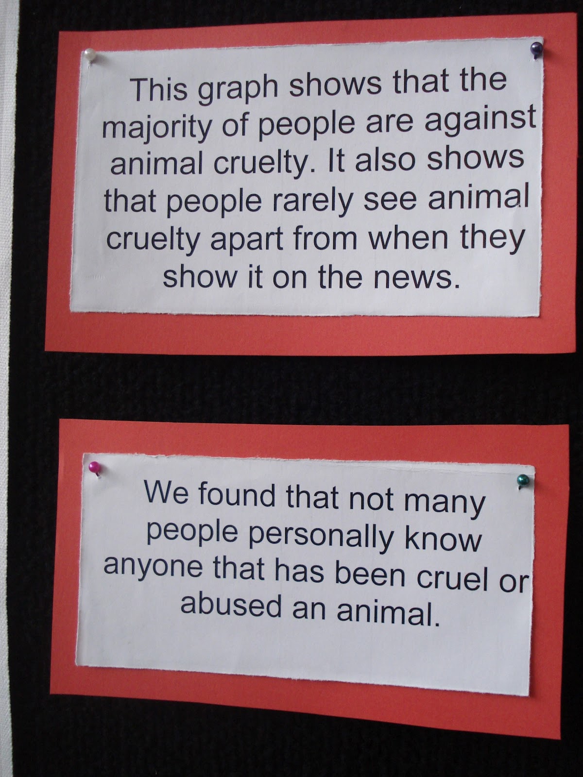
This was an interesting graph for several reasons. The group had survey over 200 people and organised their data into a series of effective graphs. They also provided an interesting explanation of their results. The data was honest - but what does it mean to say that 6 people were in favour of animal cruelty?


  Some Other Really Interesting Ideas

And here's some other ideas that the kids came up with. They are really special - hope you enjoy!


 Using balance scales - put a marble in the side you vote for


Same idea using coffee beans to show support for Fairtrade. 


Put a soccer ball on the field you show your response - yes, no or maybe


 A graph using Skittles. This group has to scale down their data. They would have needed 2 million Skittles otherwise and couldn't find a bottle big enough.


Other ways to use bottles to represent data


 And the final example - this group made their own basketball hoops and you could indicate your response by shooting a ball through the appropriate hoop - yes or no.


Tuesday, 7 August 2012

Maths and the Year 6 Exhibition

Year 6 Exhibition - what's that?!


Our school operates under the International Baccalaureate Primary Years Programme (PYP). A key part of this programme is the Year 6 Exhibition, a culminating activity designed to demonstrate the awareness and understanding of the students of what they have learnt over their time in the PYP.


It involves group work.

It elicits deeper learning.

It is a transdisciplinary inquiry.

So I'm keen to see how our Year 6 students are going to use their maths skills and knowledge to explore this year's concept of "Conflict".


The Good News - I am a Mentor!

Each collaborative group finds or is assigned a mentor - someone who can help the group find their direction, clarify their questions and distill their message.

Fortunately for the group that I will be mentoring, I will have a special interest in how they explore the concept of "Conflict".

And, of course, how they use their maths skills as part of this inquiry.


The Bad News - I am a Mentor!


So look out team - you have been warned! I'm looking for something more than a column graph and a table of numbers. I'm hoping to see some creative and insightful uses of maths skills to underpin this significant inquiry into a big, big concept.

I'll let you know how the team and I get along as the journey unfolds...